Getting Started
An overview of Bootstrap, how to use, basic templates and examples, and more.
An overview of Bootstrap, how to use, basic templates and examples, and more.
Download Basic Bootstrap+ Package Here.
Once downloaded, unzip the compressed folder to see the structure of (the compiled) Bootstrap. You'll see something like this:
Bootstrap/
├── css/
│   ├── bootstrap.min.css
│   ├── ie10-viewport-bug-workaround.css
├── js/
│   ├── bootstrap.min.js
│   └── ie10-viewport-bug-workaround.js
└── fonts/
    ├── glyphicons-halflings-regular.eot
    ├── glyphicons-halflings-regular.svg
    ├── glyphicons-halflings-regular.ttf
    └── glyphicons-halflings-regular.woff

BootstrapAddOns/
└── FontAwesome/
    ├── css/
    │	 └── font-awesome.min.css
    └── fonts/
         ├── FontAwesome.otf
         ├── fontawesome-webfont.eot
         ├── fontawesome-webfont.svg
         ├── fontawesome-webfont.ttf
         ├── fontawesome-webfont.woff
         ├── fontawesome-webfont.woff2
         └── version.txt

css/
├── nvsn-bootstrap.css
├── nvsn-global.css
├── nvsn-global-responsive.css
├── nvsn-widget.css
├── nvsn-widget-responsive.css
└── nvsn-temp.css

js/
└── custom.js
This is the most basic form of Bootstrap + : precompiled files for quick drop-in usage in nearly any web project.
We provide the compiled and minified CSS and JS (bootstrap.min.*) including Fonts from Glyphicons.
The popular FontAwesome has been added as part of our BootstrapAddOns directory to provide a wider variety of icons.
A set of custom stylesheets are located at the root level:
nvsn-global.css - It covers the branding design styling by creating brand classes and/or handling existing properties/classes from bootstrap.nvsn-global-responsive.css - This css has been created to cover the responsivceness fixes which apply globally. A set of extra helpers have been custom made and placed them here.nvsn-widget.css - This stylesheet is empty. It will be used to create custom styles for a specific page, portal or widget. Carefully decide whether your custom classes are not needed globally for easyt maintenance.. nvsn-widget-responsive.css - to cover responsiveness of the sutomized css.nvsn-temp.css - Created to assist visually to Designers and Programmers while developing. Will display a vertical line to your right Please note the stylesheet declaration order within every html structure is very important.
Start with this basic HTML template.
Copy the HTML below to begin working with a minimal Bootstrap+ template.
<!DOCTYPE html>
<html lang="en">
  <head>
    <meta charset="utf-8">
    <meta http-equiv="X-UA-Compatible" content="IE=edge">
    <meta name="viewport" content="width=device-width, initial-scale=1">

    <!-- The above 3 meta tags *must* come first in the head; any other head content must come *after* these tags -->
    <title> Basic Template</title>

    <!-- Bootstrap Core CSS -->
    <link href="Bootstrap/css/bootstrap.min.css" rel="stylesheet" type="text/css">

    <!-- IE10 viewport hack for Surface/desktop Windows 8 bug -->
    <link href="Bootstrap/css/ie10-viewport-bug-workaround.css" rel="stylesheet" type="text/css">

	<!--[if lt IE 9]>
	      <script src="https://oss.maxcdn.com/html5shiv/3.7.3/html5shiv.min.js"></script>
	      <script src="https://oss.maxcdn.com/respond/1.4.2/respond.min.js"></script>
	    <![endif]-->

	<!-- Awesome Font CSS -->
	<link href="BoostrapAddOns/FontAwesome/css/font-awesome.min.css" rel="stylesheet" type="text/css">

	<!--  Global CSS -->
	<link href="css/nvsn-global.css" rel="stylesheet" type="text/css">
	<link href="css/nvsn-global-responsive.css" rel="stylesheet" type="text/css">

	<!--  Widget CSS When Needed -->
	<link href="css/nvsn-widget.css" rel="stylesheet" type="text/css">
	<link href="css/nvsn-widget-responsive.css" rel="stylesheet" type="text/css">

	<!--  Temp CSS - Provides Visual Assistance by Identifying Responsive Breakpoints - To Use Under Development Only -->
	<link href="css/nvsn-temp.css" rel="stylesheet" type="text/css">

  </head>
  <body>

    <h1>Hello, world!</h1>

    <!-- Bootstrap core JavaScript -->
    <!-- Placed at the end of the document so the pages load faster -->
    <script src="https://ajax.googleapis.com/ajax/libs/jquery/2.2.4/jquery.min.js"></script>
    <script src="Bootstrap/js/bootstrap.min.js"></script>

    <!-- IE10 viewport hack for Surface/desktop Windows 8 bug -->
    <script src="Bootstrap/js/ie10-viewport-bug-workaround.js"></script>

    <!-- Custom JavaScript, When Needed -->
    <script src="js/custom.js"></script>

  </body>
</html>Build on the basic template above with Bootstrap's many components. We encourage you to customize and adapt Bootstrap to suit your individual project's needs.

Nothing but the basics: Bootstrap CSS and JavaScript along with EVPS Scheme.
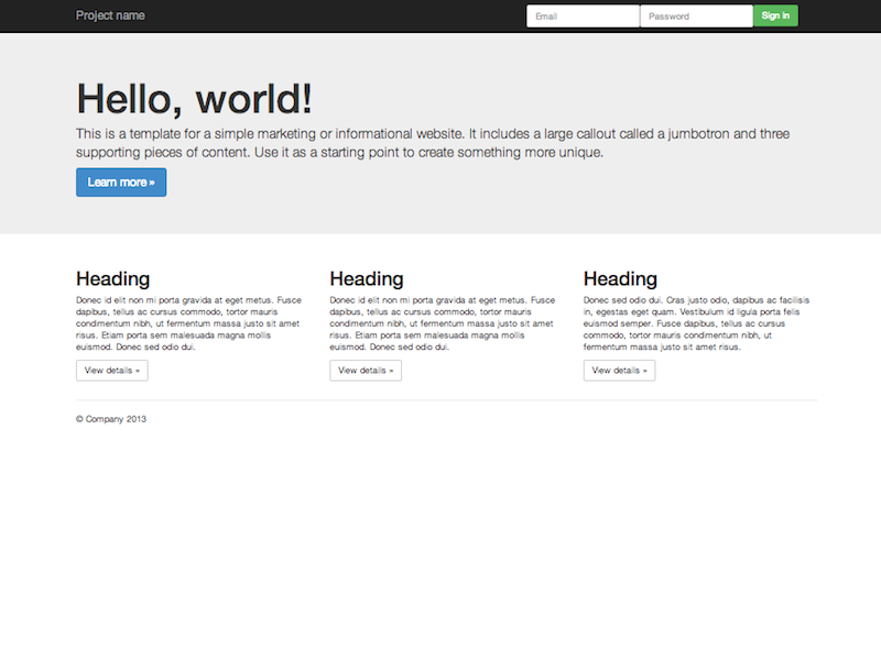
Build around the jumbotron with a navbar and some basic grid columns.
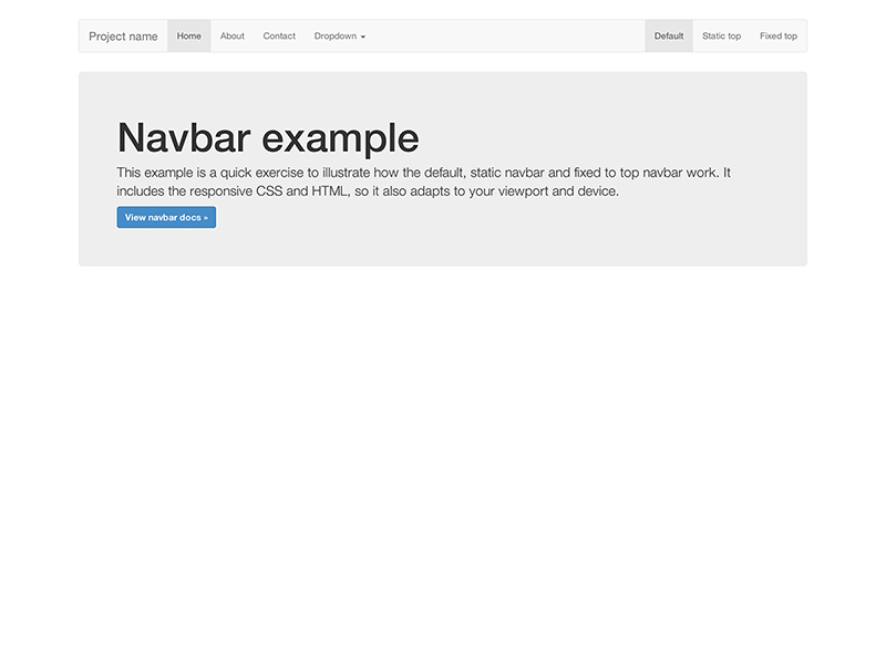
Super basic template that includes the navbar along with some additional content.
Stay up to date on the development of Bootstrap and reach out to the community with these helpful resources.
Bootstrap is built to work best in the latest desktop and mobile browsers, meaning older browsers might display differently styled, though fully functional, renderings of certain components.
Specifically, we support the latest versions of the following browsers and platforms. On Windows, we support Internet Explorer 8-11. More specific support information is provided below.
| Chrome | Firefox | Internet Explorer | Opera | Safari | |
|---|---|---|---|---|---|
| Android | Supported | Supported | N/A | Not Supported | N/A |
| iOS | Supported | N/A | Not Supported | Supported | |
| Mac OS X | Supported | Supported | Supported | Supported | |
| Windows | Supported | Supported | Supported | Supported | Not Supported |
Unofficially, Bootstrap should look and behave well enough in Chromium and Chrome for Linux, Firefox for Linux, and Internet Explorer 7, though they are not officially supported.
Internet Explorer 8 and 9 are also supported, however, please be aware that some CSS3 properties and HTML5 elements are not fully supported by these browsers. In addition, Internet Explorer 8 requires the use of Respond.js to enable media query support.
| Feature | Internet Explorer 8 | Internet Explorer 9 |
|---|---|---|
border-radius |
Not supported | Supported |
box-shadow |
Not supported | Supported |
transform |
Not supported | Supported, with -ms prefix |
transition |
Not supported | |
placeholder |
Not supported | |
Visit Can I use... for details on browser support of CSS3 and HTML5 features.
Beware of the following caveats when using Respond.js in your development and production environments for Internet Explorer 8.
Using Respond.js with CSS hosted on a different (sub)domain (for example, on a CDN) requires some additional setup. See the Respond.js docs for details.
file://Due to browser security rules, Respond.js doesn't work with pages viewed via the file:// protocol (like when opening a local HTML file). To test responsive features in IE8, view your pages over HTTP(S). See the Respond.js docs for details.
@importRespond.js doesn't work with CSS that's referenced via @import. In particular, some Drupal configurations are known to use @import. See the Respond.js docs for details.
IE8 does not fully support box-sizing: border-box; when combined with min-width, max-width, min-height, or max-height. For that reason, as of v3.0.1, we no longer use max-width on .containers.
IE8 has some issues with @font-face when combined with :before. Bootstrap uses that combination with its Glyphicons. If a page is cached, and loaded without the mouse over the window (i.e. hit the refresh button or load something in an iframe) then the page gets rendered before the font loads. Hovering over the page (body) will show some of the icons and hovering over the remaining icons will show those as well. See issue #13863 for details.
Bootstrap is not supported in the old Internet Explorer compatibility modes. To be sure you're using the latest rendering mode for IE, consider including the appropriate <meta> tag in your pages:
<meta http-equiv="X-UA-Compatible" content="IE=edge">Confirm the document mode by opening the debugging tools: press F12 and check the "Document Mode".
This tag is included in all of Bootstrap's documentation and examples to ensure the best rendering possible in each supported version of Internet Explorer.
See this StackOverflow question for more information.
Internet Explorer 10 doesn't differentiate device width from viewport width, and thus doesn't properly apply the media queries in Bootstrap's CSS. Normally you'd just add a quick snippet of CSS to fix this:
@-ms-viewport { width: device-width; }However, this doesn't work for devices running Windows Phone 8 versions older than Update 3 (a.k.a. GDR3), as it causes such devices to show a mostly desktop view instead of narrow "phone" view. To address this, you'll need to include the following CSS and JavaScript to work around the bug.
@-webkit-viewport   { width: device-width; }
@-moz-viewport      { width: device-width; }
@-ms-viewport       { width: device-width; }
@-o-viewport        { width: device-width; }
@viewport           { width: device-width; }
if (navigator.userAgent.match(/IEMobile\/10\.0/)) {
var msViewportStyle = document.createElement('style')
msViewportStyle.appendChild(
document.createTextNode(
'@-ms-viewport{width:auto!important}'
)
)
document.querySelector('head').appendChild(msViewportStyle)
}For more information and usage guidelines, read Windows Phone 8 and Device-Width.
As a heads up, we include this in all of Bootstrap's documentation and examples as a demonstration.
As of Safari v7.0.1 for OS X and Safari for iOS v7.0.1, Safari's rendering engine has some trouble with the number of decimal places used in our .col-*-1 grid classes. So if you have 12 individual grid columns, you'll notice that they come up short compared to other rows of columns. We can't do much here (see #9282) but you do have some options:
.pull-right to your last grid column to get the hard-right alignmentWe'll keep an eye on this though and update our code if we have an easy solution.
Support for overflow: hidden on the <body> element is quite limited in iOS and Android. To that end, when you scroll past the top or bottom of a modal in either of those devices' browsers, the <body> content will begin to scroll.
Also, note that if you're using inputs in your modal or navbar, iOS has a rendering bug that doesn't update the position of fixed elements when the virtual keyboard is triggered. A few workarounds for this include transforming your elements to position: absolute or invoking a timer on focus to try to correct the positioning manually. This is not handled by Bootstrap, so it is up to you to decide which solution is best for your application.
The .dropdown-backdrop element isn't used on iOS in the nav because of the complexity of z-indexing. Thus, to close dropdowns in navbars, you must directly click the dropdown element (or any other element which will fire a click event in iOS).
Page zooming inevitably presents rendering artifacts in some components, both in Bootstrap and the rest of the web. Depending on the issue, we may be able to fix it (search first and then open an issue if need be). However, we tend to ignore these as they often have no direct solution other than hacky workarounds.
Even in some modern browsers, printing can be quirky. In particular, as of Chrome v32 and regardless of margin settings, Chrome uses a viewport width significantly narrower than the physical paper size when resolving media queries while printing a webpage. This can result in Bootstrap's extra-small grid being unexpectedly activated when printing. See #12078 for some details. Suggested workarounds:
@screen-* Less variables so that your printer paper is considered larger than extra-small.Out of the box, Android 4.1 (and even some newer releases apparently) ship with the Browser app as the default web browser of choice (as opposed to Chrome). Unfortunately, the Browser app has lots of bugs and inconsistencies with CSS in general.
On <select> elements, the Android stock browser will not display the side controls if there is a border-radius and/or border applied. (See this StackOverflow question for details.) Use the snippet of code below to remove the offending CSS and render the <select> as an unstyled element on the Android stock browser. The user agent sniffing avoids interference with Chrome, Safari, and Mozilla browsers.
<script>
$(function () {
  var nua = navigator.userAgent
  var isAndroid = (nua.indexOf('Mozilla/5.0') > -1 && nua.indexOf('Android ') > -1 && nua.indexOf('AppleWebKit') > -1 && nua.indexOf('Chrome') === -1)
  if (isAndroid) {
    $('select.form-control').removeClass('form-control').css('width', '100%')
  }
})
</script>
Want to see an example? Check out this JS Bin demo.
Bootstrap follows common web standards and—with minimal extra effort—can be used to create sites that are accessible to those using AT.
If your navigation contains many links and comes before the main content in the DOM, add a Skip to main content link immediately after your opening <body> tag. (read why)
<body>
  <a href="#content" class="sr-only sr-only-focusable">Skip to main content</a>
  <div class="container" id="content">
    The main page content.
  </div>
</body>When nesting headings (<h1> - <h6>), your primary document header should be an <h1>. Subsequent headings should make logical use of <h2> - <h6> such that screen readers can construct a table of contents for your pages.
Learn more at HTML CodeSniffer and Penn State's AccessAbility.